What is the brand image?
Today, due to the multiplicity of brands and related services and goods providing by service providers and manufacturers, there is severe competition in the market for more sales, and therefore the importance of powerful and effective advertising is much higher than in the past.
It should be noted that effective advertising should be determined by a branding strategy. This is a very serious and necessary specialization in today’s business.
Consequently, the role of branding experts becomes very impressive. There are several methods in a brand promotion that are picked based on the type of goods and services offered and the company’s budget.
These include printing banner ads, brochures, website developments and pages on social networks and producing associated content, banner ads on the Internet, video ads on TV and video sharing websites, and so on.
But whichever sort of advertising is chosen, the role of the logo design in brand advertising is very impressive. Surely, brands try to bring their brand logo to the audience in each of the above types of advertisements.
Expressive brand image:
In fact, a logo is an image that describes in brief and represents the type and activity of a business and the services or goods it provided. Therefore, it must be designed expressively and emotionally. By giving an example, we try to explain the concept of the logo being expressive. Most people in the world must have seen the logo of the International Olympic Committee, which is additionally the logo of the Olympic Games.
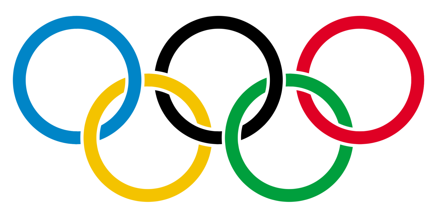
The logo of the International Olympic Committee!
Simply anyone who has seen this logo without prior knowledge of its content will understand the message of this professional logo design. This is a successful example of logos that clearly shows the message and nature of the activity of the associated institution.
Logos that are efficient and effective in advertising can be placed in several categories of visual, text, composition, and slogan.
In image logos, only one image is used to transfer the desired concept of the brand. A successful example of this type of logo is the Apple logo, which we see only the image of an apple.
In-text logos, several letters are utilized. The Google Corporate logo is one of the most successful models of these logotypes. Some logos, also called combination logos, have a special image next to the company brand.
The logo of the Nike sportswear brand is one of the most successful examples of hybrid logos. Slogan logos also remind the audience of the desired slogan and message of the brand.
Nokia Telecommunication brand utilizes this type of logo and in this logo; two hands are near to each other, which represents the company’s motto, which is to communicate.
A customer looks at the world with two horizontal eyes on their heads. Just like looking out the windshield. For the highest visual experience, the brand design and logo should be in the shape of the windshield. That is approximately 2.25 in width and one unit in height
The logo design should be such that it draws the attention of both eyes of the viewer. A logo is a combination of a trademark, which is the visual symbol of a brand, and the written form of the trademark is a combination of the letters of the company name that identifies the company or organization (visual brand identity) that the graphic designer formulates.
Text logo design (logotype) appears in several forms. Round, oval, horizontal, vertical; But not all forms are the equivalent for the customer.
Because each customer’s eyes are next to each other, the optimal shape of the brand should be horizontal. Approximately 1.6 unit wide and 1 unit high.
This horizontal shape provides the highest visual contact for your brand. This is a fact that applies to any logo design that is used anywhere: on buildings, designing brochures, designing catalogs, invitation cards, and so on.
What is the brand image? What is the most notable feature in designing a logo?
The readability of the logo design text for a brand plays the most important role.
Some designers use all sorts of tricks to get attention in brand design, but do not care about readability.
Typed letters appear in different patterns and weights, but customers are rarely aware of this difference.
What type of letters well-known companies like Rolex or Rolls-Royce Watch choose?
The fact is that the word Rolex and Rolls-Royce convey the strength of the brand. The shape of the letters on their trademark can enhance or reduce this transition.

The shape of the letters trademark can enhance or reduce this transition

Rolex professional logo
On the other hand, if these letters do not have the necessary legibility, the brand will not make sense in the mind of the consumer. Not because of the typeface, but because the audience is unable to read it.
Readability is the most important point that we must pay attention to when choosing printed letters in logo design.
Certainly, there are principal differences in the emotion that the brand conveys. San Serif looks new and fresh, Serif looks old. Bold prints look masculine and fonts look light, feminine! In this blog, we want to address whether the symbol alone can convey the power of a brand or it needs to be accompanied by the writing of the brand name? Is it not better to be the visual symbol of a brand, the written structure of the brand name?
There are only a few simple symbols that build influential and effective business logos (such as the three-pointed star of Mercedes-Benz).
If history would not present you one of the simple symbols, maybe now, to create Such a symbol is too late.
The power of the Nike symbol in the branding of that company:
We all know that the concept is in the word, not the visual symbol. It is the Nike name that gives meaning to the symbol and the symbol does not give much meaning to the Nike brand. Once a symbol has been associated with the brand for a long time, the symbol can replace the text. However, it is still the brand that conveys credibility and power.

Nike company logo
The advantage of using the symbol alone is very little and it is used in certain situations. For example, when you see the logo at a distance while you cannot read it put it on the product itself or beside of slogan that is written about the product, with this trick, the brand will seem very promotional. Maybe after spending $ 100 million annually to link the Nike name and its logo, you will end up with Just show the symbol.
Compare Shell and Mobile companies, for example. Shell has its symbol installed at the gas station without mentioning Shell’s name. The car has a trademark in the blueprint and a red letter in the blue letters that spell the word mobile.

Shell company symbol

Mobil company logo
Which method is correct?
“The Sheel method “has a special advantage due to its short name and simple symbol but as people grow and new audiences enter the market, how will they understand the meaning of the yellow logo, which is a loose sign?
The power of a brand in branding is in the sense that it is established in the mind of the audience, and in most brands, a logo has little to do with creating the concept in the mind of the audience.
There are only a few simple symbols that create influential and effective logos (such as the three-pointed star of Mercedes-Benz). If history did not intend to give you one of the simple symbols, perhaps now, to create such a symbol is too late!
Thanks for reading our post, we are looking forward to hearing your comments on this!
NeatMarketing Group.


